Thirdly, blue is universally linked with beauty and transcends in time (Dasgupta, no date). Dasgupta (no date) states that blue, when combined with another colour, will give different interpretations, such as when blue is mixed with red, it will form violet and demonstrate adaptability, and when blue is combined with yellow, it will form green families. According to Dasgupta (no date), blue has a deep connection to the sky and sea, so it can be interpreted that blue reflects the sturdiness of slate and the airy quality of clouds; also, it can arouse feelings of brightness and depth, clarity and mystery, and joy and grief. Moreover, "Psychologically, blue is strongly associated with feelings of tranquillity and contentment, calming the mind and soothing the soul." (Dasgupta, no date).
The secondary colours include green, violet, and orange. According to Dasgupta (no date), green is a natural and harmonic colour because of its unique duality, which combines blue for coolness and yellow for warmth. Vibrant yellow-green tones stimulate the beauty of nature's colour, while deep green tones imply security and elegance (Dasgupta, no date). Then, violet contains the visible emotional contrast, so the hue conveys a wonderfully feminine sense, delicate and vulnerable (Dasgupta, no date). Also, deep purple depicts regal grandeur and stands for leadership and dignity (Dasgupta, no date). Moreover, Dasgupta (no date) mentions that orange is a flexible colour that depicts cosiness and warmth with its earthy tone. "When rendered as a pale tint, it becomes the most flattering color for human skin tones, accentuating and enhancing natural beauty." (Dasgupta, no date).
Lastly, the tertiary colour is shaped by mixing the primary and secondary colours. For example,
- Yellow with orange, it creates yellow-orange
- Red with violet, it creates red-violet
- Blue with green, it creates blue-green
Complementary colour is the perfect theory to mix and match in clothing to make an exciting contrast. According to Nanra (2017), complementary colours can initially seem audacious, but the result can be flawless. Usually, spring and summer trends use colours that complement each other; for example, blue and orange, violet and yellow, and red and green (Nanra, 2017). Conversely, a good choice of colour combination for a party dress can be an ombre colour. Moreover, the monochromatic colour gives a "...simpler and cleaner approach to putting a great ensemble together." (IFCHIC, no date).
Knowing the undertone of the skin is the key to making the person look good. Warm undertones are suitable with earthy colours like olive or peach; cold undertones are fitted in shades of blue or jewel (Lavender Hill Clothing, no date). Also, Lavender Hill Clothing (no date) mentions that the colour for the season is also essential to consider. In summer, warm undertones are associated with peach or golden hue; mixing pastel colours such as turquoise, coral, and brilliant yellows is possible. According to Lavender Hill Clothing (no date), in the autumn season, it is better to wear earthy colours like browns, deep greens, beige, amber, and more because the autumn season has a tone of warm undertone; also, adding wool, leather, or suede can give the sense or warmth. In the winter season, emerald, sapphire, and ruby will be suitable for the cool undertones and for the neutral undertones, you can use grey, white, and black hues (Lavender Hill Clothing, no date). Moreover, Lavender Hill Clothing (no date) mentions that in the spring season, pastel and vibrant hues are the perfect choices, especially for the warmth undertones can use peach and pink, the cool undertones can use mint green and lilac, and the neutral undertones can use jade green and lavender. Therefore, considering the skin colour is an excellent choice to get to know the undertones colours, so while dressing will help to achieve the most suitable colour.
This list of the colours give the insight of each colour and the meaning.
And, the language of colours that can help of self-expression based on primary and secondary colour (Clarke-Keane, 2022);
- Red - excitement, passion, anger, danger, action, anxiety, power.
- Yellow - happiness, optimism, warning, joy, originality, enthusiasm.
- Blue - calm, stability, depth, peacefulness, trust.
- Green - youth, vibrancy, vigor, nature, growth, stability.
- Orange - playfulness, friendliness, creativity, warmth, enthusiasm.
- Violet - royalty, luxury, romance, introspection, calm.
The research using the colour theory technique will help me with my projects. In my designs, I will consider the colour using colour theory to achieve a good colour scheme for each fashion design. While I chose the pop art theme that has many variants of colour, this colour theory will help me decide the best colour.
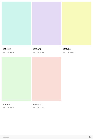
These are my colour palette that might be used in my project. The colours is based on desserts that I like, which has pastel colours and sweet.


I am never over keen on the psychology of colour posts - I am more interested in how you are developing your own colour palette for your design in relation to the trend as we talked about - please add your own colour development
ReplyDelete